
AllAboutVision.com
A site audit and redesign
Overview
In 2016 Essilor of America acquired All About Vision.com (AAV), a consumer website providing reliable, independent, eye doctor-approved information about eye care and vision correction. AAV served more than 50 million unique visitors annually. The goal was to funnel that traffic to Essilor’s business units.
If AAV was to more effectively influence consumer behavior, it needed to transform from a static encyclopedia-type site to a website that — in addition to efficiently answering visitors’ questions — provides actionable information that encourages users to schedule an eye exam and purchase eyewear.
Problems
1. Design is dated and not scalable.
2. Left column navigation is not user-friendly and takes up valuable real estate.
3. Index pages and articles are too long and have a high cognitive load (users are bouncing).
4. No clearly defined consumer journey that leads users to take desired actions.
5. Accessibility guidelines were not fully implemented.
My Role
As the lead UX Designer, it was my goal to identify and address the most glaring problems that could interrupt the user flow of researching and purchasing eyewear.
My ultimate goal was that this audit would convince our stakeholders to embrace and adopt the UX process. The redesign would give us a starting point of which we could further research, conceptualize, test our ideas, and create a seamless user experience for AAV’s users and help Essilor achieve their goals.
Logo redesign
The existing AAV logo (circa 1999) was legible but suffered from styling conventions that de-position the brand as modern and a credible resource for up-to-date content. Redesigning the logo was crucial in giving the site a fresh, inviting, and authoritative feel.
BEFORE
AFTER
Update navigation
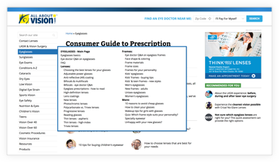
AAV’s existing left column navigation had 21 categories. This was disorienting for users and made the site difficult to navigate. It also took up a lot of screen real estate.
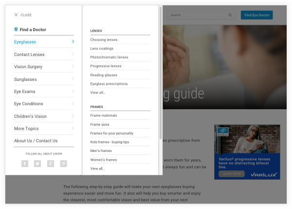
After doing several card sorting exercises, we were able to narrow down the 21 to seven main categories. We decided to use a slide-in menu that freed up the header and left column. This allowed us to use that space for a site search bar and a simplified “Find Eye Doctor” CTA.
BEFORE
AFTER
Content assessment
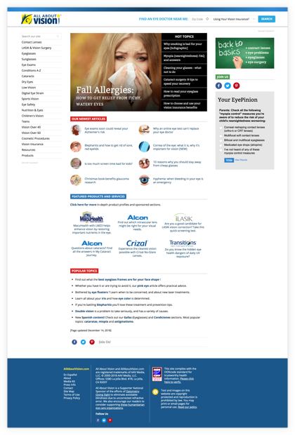
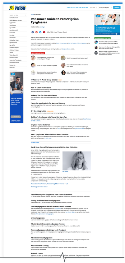
A significant problem with many of AAV’s pages was the lack of a clear content strategy. There wasn’t any hierarchy of information, and nothing to encourage the reader to further explore AAV’s content. The pages also lacked visual appeal and were a prime example of cognitive overload with nothing to help guide the user to the specific information they were seeking.
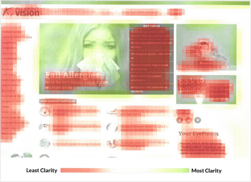
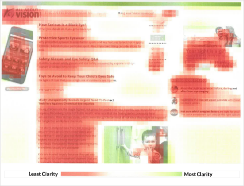
This overload was observed with EyeQuant’s Clarity Score. The current home page score 26 out of 100 for clarity. The cluttered page made CTAs less visible to users. A typical article page is even more cluttered – scoring 13 out of 100 and similarly obfuscating the “Find Eye Doctor” button.
HOME PAGE
ARTICLE PAGE
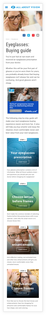
User engagement
Using heatmap data from Hotjar, we determined that most of the potential “high conversion” articles suffered from high bounce rates. The articles were very text-heavy and had a high cognitive load. From online surveys, we learned that most users thought our articles were too long. We needed to change this encyclopedic style of writing and focus more on our user’s pain points, needs, and goals.
A key aspect of creating value is engaging visitors visually and eliminating nonessential content, so you don’t overwhelm them. We started by simplifying the content and adding more white space to make pages easier to scan. Adding visual content (videos, infographics, etc.) allowed us to “chunk” information and break up long runs of copy.
Additionally, we created a “consumer journey” for each index page that would guide users through the product evaluating and purchasing process. The conversion rate for this approach was far higher than banner ads, which users had grown to ignore.
BEFORE
AFTER
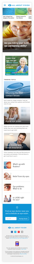

AFTER

Accessibility
In redesigning an informational eye care and vision correction website it was imperitive that WCAG guidelines were followed. The likelihood of our users having a visual impairment was high. Many of these guidelines were ignored in the previous iteration of AAV. We focused on:
1. Type size and spacing:
Providing the ability to enlarge text and adjust spacing with CSS is vital for users with low vision.
2. Contrast sensitivity and color usage:
Eye conditions like Retinitis Pigmentosa, Glaucoma, Retinopathy, and cataracts (some of the most common eye problems) lead to a significant decline in contrast sensitivity. Color blindness affects approximately 1 in 12 men (8%) and 1 in 200 women in the world. With such a large population of vision impaired users, it was vital that we follow color and contrast guidelines for UI elements, illustrations, and navigation.
3. Keyboard accessibilty:
Many visually impaired and blind users use a keyboard for navigation. Our devs needed to write the underlying source code so that the reading/navigation order was correct.
Next steps
After developing templates for all of the significant content pages, it was time for the developers to build it in our CMS. Further refinement of interactive UI elements and the creation of a Design System were next on the agenda.
This project was fast-tracked and with limited resources. I hope that future iterations will involve more in-depth front end research of our users, prototyping, and testing of our ideas. I also recommended hiring a Content Strategist to help us develop content and further refine the consumer journey.