Ascend
Elevating the climbing experience
Overview
The Ascend app was ideated after I discovered a void in the rock-climbing community for a digital tool that would assist climbers in social networking as well as finding and recording climbs. My goal was to ideate a subscription-based climbing app and then create prototypes that could be presented to potential investors.
Problem
Though several climbing apps existed, none fully addressed climbers’ wants and needs. Otherwise useful features were hampered by poor UI and implementation. As a result, those apps were not embraced by the rock climbers. My goal was to prototype a new app that addressed users’ needs and the shortcomings of existing apps.
My Role
I was the sole UX Designer for this project and responsible for:
- User research
- Identification of problems
- Ideation and design
- Prototyping
Process
Following IDEO’s Human-Centered Design Thinking process, my design decisions were based on user research and feedback.
-
Empathize
-
Define
-
Ideate
-
Prototype
-
Test
Interviews and Personas
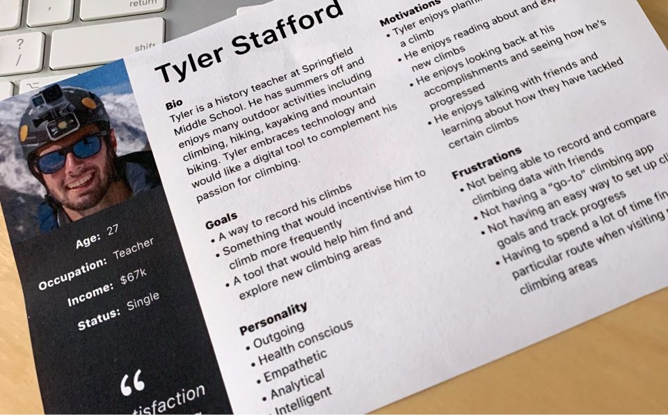
My first step was to interview four users who would be the basis for my personas. Two interviews were conducted on-site at a climb at Ralph Stover State Park, Pennsylvania. My presence on-site greatly enhanced my understanding of these climbers’ goals and opened my eyes to certain limitations they face when they attempt to use an app. Two other interviews were conducted through a series of phone calls and emails. I also supplemented my investigations with online research that gave me a broader understanding of the rock-climbing community and culture.

“I get satisfaction by completing goals. Having a place where I can easily record my climbs and review my achievements would be awesome.”
“Being able to quickly zero in on the base of a climbing route would be a game changer!”
Competitive analysis
Next, I completed a quick competitive analysis of Sloper, Mountain Project (REI), and MyClimb. I created a spreadsheet listing the pros and cons as well as the strengths and weaknesses of each competitor’s app. Researching each app also allowed me to explore user flows, core functions, and usability. User reviews allowed me to validate the negative and positive aspects of each app.
Defining the problems
Pain point 1: Users need an effective way of recording climbs
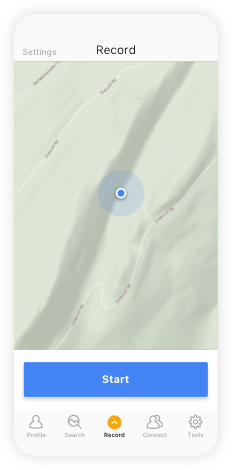
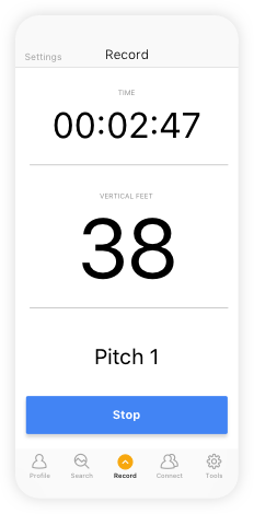
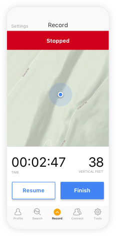
Only one existing app allowed for the recording of climbs. The process involved with this app was cumbersome and did not allow for multiple pitches. Opportunities for input were also limited (hanging 100 feet up on a rock face was not conducive to using your hands for input!). The app needed voice input functionality to be truly user-friendly.
Hanging 100 feet up on a rock face was not conducive to using your hands for input. The app needed voice commands and feedback to be truly user-friendly.
Pain point 2: Users don’t have a way to compare stats and network
This is a potential major selling point of the Ascend app, which can collect climbing statistics for sharing with friends and other climbers. This enhanced ability also provides the opportunity for competitions, incentives, and awards.
Pain point 3: Users have difficulty finding routes
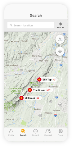
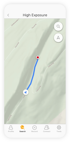
While exploring the base of hundreds of yards of sheer cliff face, it is often challenging for climbers to locate a specific route. Using GPS coordinates and map guidance would allow app users to easily identify the start of a climb within feet.
User Scenario: Finding Routes
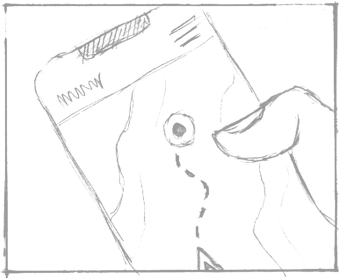
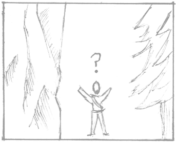
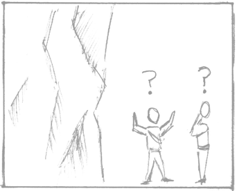
I storyboarded several scenarios to help define the existing user journey. Using these visuals helped me ideate and refine the proposed user flow at the component level.
Existing scenario for finding a route (story level):

STEP 1
Search for a route online or reference a route published in a book or article. Print out pictures of the cliff face if any are available. Print out or write down any distinctive features that would help locate the route.
STEP 2
Refer to Google Maps and topo maps for approximate location.
STEP 3
Hike base of cliff to look for any tell-tale markings. Hike away from cliff to see upper cliff features. Contend with obstructed views from trees and obstacles such as streams.
STEP 4
As a last resort, ask other people on the trail if you are lucky enough to find someone.
Proposed User Flow for finding a route (component level):
STEP 1
Search by location or near me
STEP 2
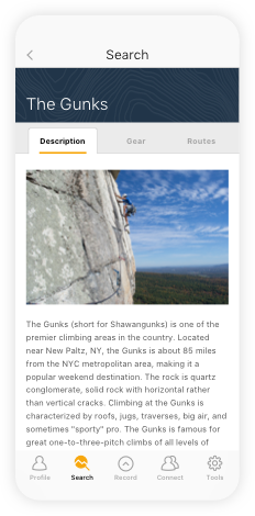
Select general climb area from results
STEP 3
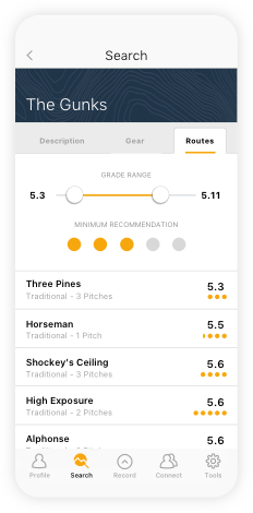
Select specific route from results
STEP 4
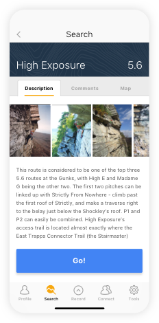
Select GO
STEP 5
Follow GPS guidance
STEP 6
Arrival message
Ideating solutions – thumbnails and wireframes
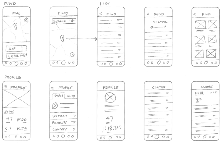
Sketching is a quick and efficient way to ideate workflows and scenarios. It keeps me from getting caught up in the technology and instead focuses my attention on creating the best possible solutions. Through sketches, I achieve preliminary validation that helps me refine my ideas. I then move on to wireframing the basic workflows.
Developing Hi-Fi mockups
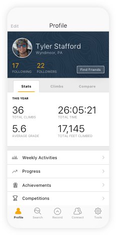
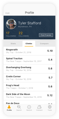
I used Sketch to create Hi-Fi mockups of my proposed solutions and used InVision to create interactive prototypes. I tested the prototypes with the four users. Using their feedback, I went through several rounds of iterations before arriving at my final solutions, as shown below.
User profile/stats and social networking:

Search and find routes:
Record route:
Voice commands and feedback:
Microinteractions and animation
Screen transitions, scroll interactions, and animations were designed using Sketch, Flinto, and Rotato. The resulting three-dimensional mockup can now be used for promotion or to guide developers when the final app is built.
Takeaways
Ascend represents a potentially valuable and marketable tool for the climbing community if time and resources could be devoted to the development of this app. Additionally, incentives such as competitions and awards could be developed to add value for subscribers. While engaged in the ideation phase, I also saw the potential for the development of an Apple Watch wearable case.
