
Essilor Doctor Directory
Overview
Essilor of America is a global company that designs, manufactures, and markets a wide range of lenses to improve and protect eyesight. In 2016 they acquired All About Vision.com (AAV), a consumer website providing reliable, independent, eye doctor-approved information about eye care and vision correction.
AAV served more than 50 million unique visitors annually. It was the goal of Essilor’s stakeholders to funnel that traffic to Essilor’s Doctor Directory. Call to Action (CTA) buttons were placed in key articles to guide those looking to purchase eyewear to Essilor’s preferred in-store partners and e-commerce properties.
Problem
Initial attempts by Essilor to promote the Directory on AAV were not producing desired results. The average industry conversion rates were around 0.5%. Essilor’s efforts were converting 0.2%.
Our research determined that conversion issues were twofold. Existing CTA placement at the end of articles was not optimal due to the length and cognitive load. Users were bouncing before they reached the CTA. Also, the Doctor Directory itself did not carry the same authoritative weight that AAV had established. The interface and experience were not as polished as users would have liked. 80% of the users were bouncing when they landed on the Directory homepage. The Directory needed a facelift.
My Role
As the primary UX Designer on this project, I was tasked with optimizing CTA placement and refining the Doctor Directory experience for mobile. I collaborated with a Content Manager, several analysts, and the Directory development team. I was responsible for:
- Helping analyze Hotjar, Google Analytics, and Optimizely data
- Identification of problems and pain points
- Ideation and design
Scope and constraints
We needed a quick win to get additional resources and funding. This meant we were working with a minimal budget and a swift turnaround. We did not have the resources or timeline for interviews and testing. We had to rely on our knowledge of UX best practices and our ability to analyze existing data.
Identifying CTA problems
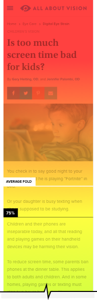
While analyzing Hotjar tap and scroll heatmaps, it became very apparent that, on most articles, users were bouncing before they even reached the CTA, which were typically placed at the end of the article. The articles that were getting better conversion rates had much shorter content and a lower cognitive load.
Our options were to:
- Shorten and re-write non-converting articles or
- Re-think our overall strategy for CTA placement.
We decided to investigate and refine our CTA placement.
CTA placement for maximum impact
Placing the CTA higher up in the article was an obvious solution but not without problems. Interrupting the flow of the article was an issue. Any accompanying image or CTA text might clash with the article contents. Also, asking the user to tap a button and leave the page just after they started to read an article seemed risky.
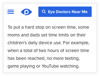
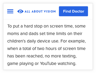
We decided to explore placing the CTA in a sticky header where it would be separate from the article but would enjoy visibility as the user scrolled through the article. We quickly worked through multiple iterations.
Version 1 combined a large CTA button and an abbreviated version of the AAV logo. Unfortunately, we’re not Apple. To users not familiar with AAV branding, the logo came across as a button. This behavior was observed with Hotjar click maps.
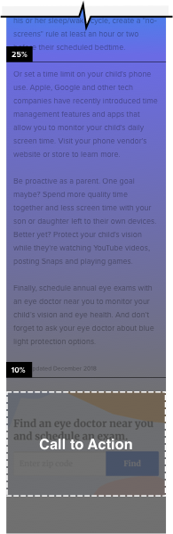
Version 2 used shorter CTA text but the logo became so small that it was almost insignificant.
Version 3 solved the above problems and left the header intact. The CTA appears when a user scrolls to a certain point in the article. It also allows the user to opt-out if they wanted to reclaim screen real estate. The team also A/B tested several color variations of the CTA button. The same blue as our logo and interface proved to be the most effective.
Identifying Directory problems
Initially designed and developed internally by the Directory Team, the existing directory was marred by numerous problems:
- Inconsistent UI, color scheme, imagery, and typography
- An 80% bounce rate on the landing page
- No easy way to make an appointment online
- Feedback from surveys – lack of trustworthiness and functionality
From interviews with internal stakeholders we determined that successfully using the directory involves four steps:
- Finding the directory
- Using the directory to find the desired doctor
- Getting directions from your starting point to their location and/or
- Making an appointment
Task Analysis
A task analysis was created to map out the structure, hierarchy, organization, and relationships across content so that users can fluidly navigate the directory to accomplish their desired goals. This analysis was developed by researching UX best practices and similar online directories. We also consulted with developers, SME’s, and stakeholders.

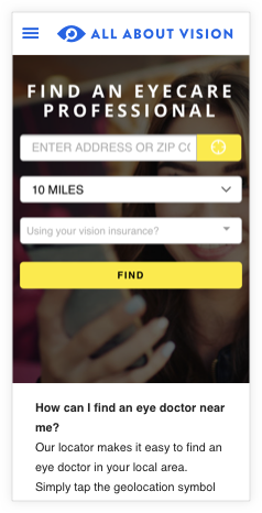
Step 1: Finding an eye doctor
My focus on this landing page was to clean up the inconsistent UI elements, color scheme, typography and to lose the non-descript background photo. I added “I’m looking to” drop-down to help filter out non-relevant results.
BEFORE
AFTER

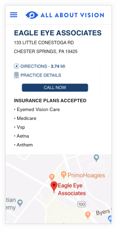
Step 2: Finding the location
Finding locations and directions is one of the top tasks for users on mobile phones. How quickly and easily, users find your location using mobile websites and apps can have a huge effect on your conversion rate. Distracting UI and non-conventional navigation can easily hamper a user’s search effort.
BEFORE
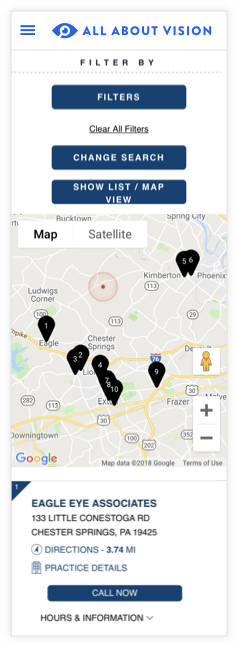
The Filter By buttons occupied too much screen space. The Show List/Map View button is somewhat vague since both map, and list view results are shown. Also, the map placement interfered with the ability of the user to scroll below it to see the list results. This causes significant usability issues for users when they attempt to scroll down the page and instead inadvertently activate the map’s pan functionality.
AFTER
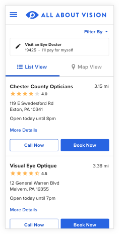
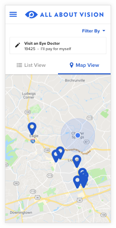
Separate List View and Map View tabs allow users to toggle views and resolves the panning/scrolling problem. List View was made the default since it provides a higher information density for location options (as opposed to opening and closing individual pinpoint annotations on a map), and it makes it faster and easier for users to select a location. We also consolidated the search and filter parameters.
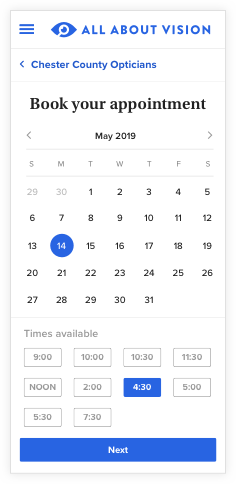
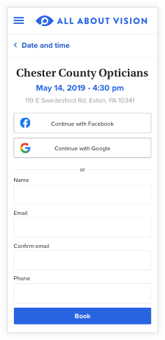
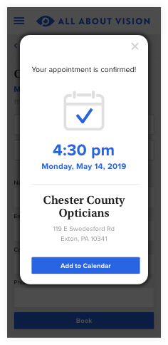
Step 3: Making an appointment
The existing Doctor Directory could not book appointments. Working with our developers, we researched the functionality of several online calendars for our booking system. We needed to take into account that not all practitioners were running the same calendar software. A quick survey determined that the most employed calendars were Google Calendar, Outlook Calendar, and iCal. It was vital that practitioners could sync their calendars with the site and provide the most updated version of their calendar to our users. After nailing down functionality with our developers, I designed the UI for each step of the process.
Outcome and lessons
Within three months of deploying the revised CTA and Directory, the conversion rate jumped from 0.2% to 2.0%! That’s an increase of 10 times! Needless to say, Essilor stakeholders are ecstatic, and I think our users are enjoying the revisions.
PREVIOUS CONVERSION
NEW CONVERSION
INCREASE OF
Unfortunately, the development team underestimated the complexity of implementing the appointment functionality. In retrospect, we probably should have consulted some outside help with this part of the project. It’s currently offline, but I am hoping they get the kinks worked out so that our users will enjoy an even more fluid and enjoyable experience.